
Novel Land
iOS & Android
Where novel lovers and future novel lovers can go to discover and enjoy their favorite stories.
_edited.png)
Overview | Why it works | Design Process | Research | Background

Welcome to NovelLand, A world built for culture and discovery!
NovelLand was a product of a 3-Day Design Challenge issued to me from the Director of Product Experience at Transflo.
I was not selected but I still wanted to highlight my design sprint as I am quite proud of the product.
Prototype:
Team


The people of Novel Land
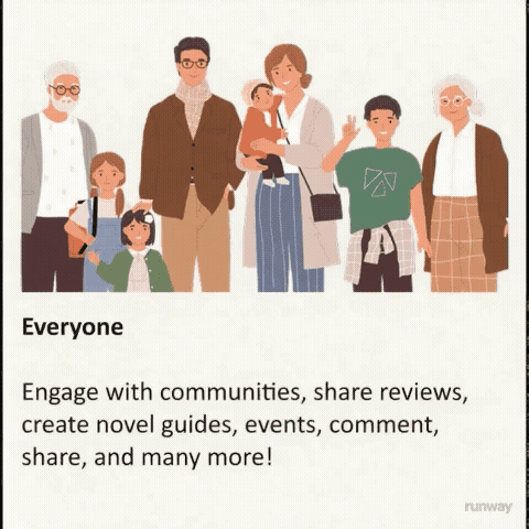
NovelLand is a place where novel lovers and future novel lovers can go to discover and enjoy their favorite stories.
This app is for everyone, a space to facilitate engagement, learning, and discovery for every user, because of this, we require the user’s age during registration and also give the capability for users to create private and public communities.
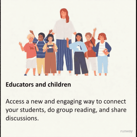
Who I hope to impact
Recently, more smartphone users are ditching the smartphone app experiences. A lot of negativity is seen on social platforms who try to bridge community experiences into their social platforms due to how accessible they are to everyone.
Videos, advertisements, short form content, complete with an infinite scroll of any kind of content showing up depletes the attention span and has caused younger generations to recognize instead of understand, memorize, and engage in higher modes of thinking.
NovelLand safeguards your attention by keeping all of the novel experiences within the app. Even external content will be screened and kept within the platform and must be related to community to avoid loosing the focus and goals of the community.
Tools I Used to Complete this Design Challenge

Figma
Used for:
-
Design Journal
-
Mockups
-
Pitch Decks
-
Prototypes
-
Design Library
-
Style Guide
-
Mockups
-
Pitch Decks
-
Prototypes
-
Design Library
-
Component Kit
_edited.png)
Requirements
Create an app that assists users find books & communities who also enjoy reading similar books and capitalizes on gamification.
Deliverables:
Design guide
Pitch Deck
Prototype

Research & Discovery
Competitive Analysis
I searched the Google Play store for Novel Rating Apps and organized my search results to only show me 4.5 and above, best of the best.
I noticed the results still were not in order so I had to break down my research into to two categories, most users and most stars.
It’s my hunch that the app with the most users probably receives the most criticism therefore the rating may be a little lower, despite theapp making it to the top of the list. They could be the most user friendly and popular due to a number of reasons, meanwhile theapp with the highest rating and smaller base of users could be more enthusiastic about Novels, therefore more savvier and loyalty to the platform or... bots.


Notable Features
What is Activity level?
Activity level is an idea based on a hypothesis I developed during my 1st round research for this project.
This app has different types of communities which cater to different users. The 1st phase of research revealed that there are different types of users in this space.
In practice, the groups may be large but may not see much as book of the month and User generated
group guide (educators, tutors, a general recommendation group for a small group of friends who meet in person, etc.)
Therefore showing status indicators such as:
Active
Moderate
Quiet
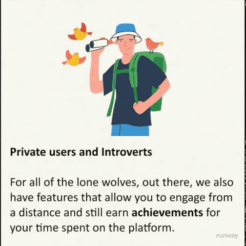
Making some group request or public could encourage the most introverted users to participate in the community feature.
An information icon “ⓘ” can also be useful for providing context to new users.


This is an active group
Despite the small user base users engage regularly.
This community is also private meaning the user must be invited, or request to join
This is a moderate group
Users who engage here post every few days or weeks. There may be an event every now and then but there are short periods of little or no activity here.
As you can see, the number of users does not impact this status
This is a quiet group
There are many users in this group but barely or no activity. Users come here potentially for suggestions, the book of the month, but little to no discussion happens here if ever.
Product Design Decisions

Navigation
Due to NovelLand being a novel focused app, a lot of reading will be done, navigation should be laid out in a matter where the user can read and navigate the app in comfortable positions.
Everything must read from left to right but users will have the option to switch certain experiences, like graphic novels, from to right to left.
I think a card approach and bottom nav bar is the best approach for general navigation.
The child page approach will be great for communities allowing each section to have more space to breath. This will give more room for activity without crowding the UI. It also gives the impression of closing and opening a book, then putting the book away.

Sketches


Wireframes
